
Equinox
web design | motion design | visual identity
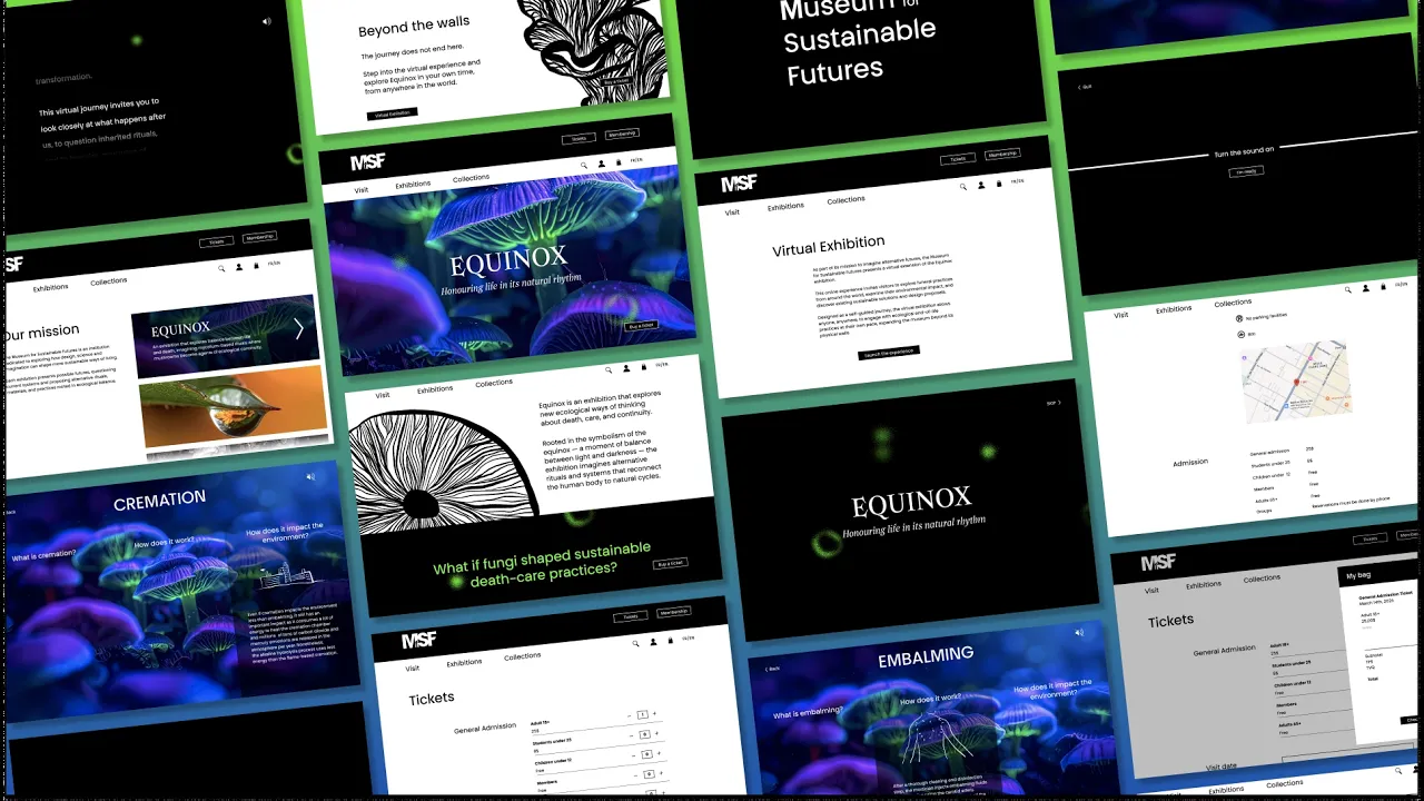
Equinox is an exhibition that explores new ecological ways of thinking about death, care, and continuity. It takes place at the fictional Museum for Sustainable Futures, in Montreal. The exhibition invites visitors to reflect on how design can support more regenerative futures, where death is not an end, but a transformation.
[Fr] Equinox est une exposition qui explore de nouvelles façons écologiques de concevoir la mort, les rituels funéraires et la continuité du vivant. Elle se déroule au sein du Museum for Sustainable Futures, un musée fictif situé à Montréal. L'exposition invite les visiteurs à réfléchir à la manière dont le design peut contribuer à un avenir plus durable, où la mort n'est plus une fin, mais une transformation.


Website
Logo Exploration

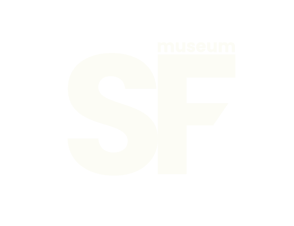


The selected logo is highly versatile, performing effectively across both small and large-scale applications. Its reversible design ensures flexibility across various formats and backgrounds, while the custom typography strengthens the museum’s visual identity. A lowercase “f” was intentionally incorporated into the logotype to clearly distinguish the Museum for Sustainable Futures from Médecins Sans Frontières and avoid potential confusion between the two organizations.
Colour Palette
White
#FFFFFF
Black
#000000
Fluo Green
#4FF109
Violet
#9B5DE5
Contrasting colours were chosen to give a strong and modern visual identity to the exhibition and its museum.
Typography

Armag Fury
Designed by Matthieu Salvaggio and published by Balze Type in 2016, Armag Fury was chosen for its delicate serifs, which convey a refined yet subtly mysterious character. Its strong stylistic presence contrasts with BBB Popins TN, used for body text, helping exhibition titles stand out clearly.
The typeface’s distinctive ligatures add typographic sophistication, elevating the exhibition titles and reinforcing their sense of refinement.

BBB Popins TN Display Regular
BBB Popins TN Display Regular was chosen to connect with a young adult audience through its contemporary and accessible tone. Originally designed by Eugénie Bidaut and Camille°Circlude, it is a post-binary typeface that reflects inclusivity and modern values. Its sans-serif, geometric structure ensures clarity and readability while providing a clean contrast to the more expressive title typeface.
Illustrations


Persona

Emma | 23 years old
"My grandmother means the world for me. I want to help her understand what is at stakes when it comes her last wishes, but I don’t know where to start."
Interests
Environment
Family
Cultural activities
Social media
Goal
To understand funeral rituals
To get informed on different options
To learn through a way dedicated to a younger public
Relation to the design
Emma clicked on the Instagram ad
She navigated the website easily
She discovered the virtual exhibition
She bought tickets for the museum
She shared the exhibition with flyers
Wireflow


Wireframe


Social Media Content
Aim
The moving image is a short video meant to be posted on Instagram to capt the interest of the young adults aged between 18 and 30 years old. The video needs to be captivating, it has to fit the instagram reel size and it needs to give all the information needed for the public to look the exhibition up on the MfSF website
Storyboard

Printed Material
Rationale
Flyers were designed to invite young adults to come and visit the Equinox exhibition displayed at the Museum for Sustainable Futures. The flyers can be hand distributed, but they can also work as a giant poster if they are placed all together.
The visual design is meant to work individually (flyers), horizontally and as a vertical rectangle (poster).
Sketches


Linocut Process


Rosalie Palin 2026